http://justcreativedesign.com/2008/05/13/how-to-design-a-movie-poster-with-an-example/
You can get different types of poster such as, the main theatrical;

or character poster;

I am creating a teaser poster, which means it will include basic information which will not indicate much about the plot, will contain an image of main character(s) and the name of the film, similar to a main theatrical poster.
Images: Son Of Perdition will be made up of black and red colours and a unique, creepy font. This is to show that it is a horror genre. I was contemplating whether to put the actor's names on the film poster as they will not be recognisable as they are not famous. Although they are an important content, films with low budgets will find actors such as Thomas Turgoose who will be more popular. The main image on the poster will be the main actor in the foreground looking scared and on the right in the background will be a black figure. This setting will be in the woods, because it is the most dominant part of the film and the main stereotypical atmosphere where everything changes. All in all, the main colours will be dark and mysterious as the content and figure is mysterious, which makes it intriguing. When seeing the poster, the viewer will automatically know it is a horror because of the scared expression on the boy's face. When they see the figure in the background they will think that the boy is being chased. By using this 18-year-old boy, it will determine my target audience of 15-30 year-olds as the stretch target. The target audience will probably like this if they are into psychological thrillers as well.
Narrative: It is clear to identify the genre of the film and the types of characters from their facial expression, body language, stance, appearance and position on the poster. The impression you get of the character/personalities is that the boy is average (clothing) and scared (expression). An enigma is being presented through the mysterious figure. The key image will not be a still from the film, but it will be similar to it (for example, they do this for most film posters such as 'Jennifer's Body' and 'Prom Night').

I have thought about the layout of my poster and have researched others to get ideas. I will concentrate on completing the poster once the main task (teaser trailer) is complete.
Layout: The poster will not be a montage of images merged together unless the camera shot does not work when I try to take the picture as there may be trouble with lighting. Such problems can arise because of the sun going down quickly; therefore I would need to shoot it on several nights at the same time. If it is difficult getting both actor's in the same shot I will take it separately and merge them next to each other. Improvements in technology have changed production values- so I will be able to produce and print it using DTP. I will also be using a tag-line- see one my previous posts to view sketched layout 'poster design'. It will include credits information in small print at the bottom like all film posters, including cast, director, distribution and promotion companies. The certificate will be at the bottom to the left. The poster will list the website to promote it further.
Above, you can see a print-screen of fonts. I found these on http://www.urbanfonts.com/, in the category called 'scary'. This is so it will meet my chilling theme. I don't want a font that is too over the top because it will seem comical. I need a font that fits in with my horror genre and a sense of mystery.
Unique Selling Point: The Unique Selling Point is a marketing perception that was first proposed as a theory to explain a pattern among successful advertising campaigns. It shows that campaigns made unique propositions to the customer and that this convinced them to switch brands and use them or in my case to come and watch my film over another film that is out at the same time. For example- M&M's: "Melts in your mouth, not in your hand".
The most challenging content is of course the male being the victim. This is different to some horrors and challenges stereotypes. The stars are also unconventional as they're not famous. Content which is conventional are the woods. I believe these combinations of conventional and unconventional themes will attract my target audience- they can relate to my main character and be placed in their shoes. I will make the trailer intriguing by not giving too much away so the audience is left wanting more.
You can get different types of poster such as, the main theatrical;

or character poster;
I am creating a teaser poster, which means it will include basic information which will not indicate much about the plot, will contain an image of main character(s) and the name of the film, similar to a main theatrical poster.
Images: Son Of Perdition will be made up of black and red colours and a unique, creepy font. This is to show that it is a horror genre. I was contemplating whether to put the actor's names on the film poster as they will not be recognisable as they are not famous. Although they are an important content, films with low budgets will find actors such as Thomas Turgoose who will be more popular. The main image on the poster will be the main actor in the foreground looking scared and on the right in the background will be a black figure. This setting will be in the woods, because it is the most dominant part of the film and the main stereotypical atmosphere where everything changes. All in all, the main colours will be dark and mysterious as the content and figure is mysterious, which makes it intriguing. When seeing the poster, the viewer will automatically know it is a horror because of the scared expression on the boy's face. When they see the figure in the background they will think that the boy is being chased. By using this 18-year-old boy, it will determine my target audience of 15-30 year-olds as the stretch target. The target audience will probably like this if they are into psychological thrillers as well.
Narrative: It is clear to identify the genre of the film and the types of characters from their facial expression, body language, stance, appearance and position on the poster. The impression you get of the character/personalities is that the boy is average (clothing) and scared (expression). An enigma is being presented through the mysterious figure. The key image will not be a still from the film, but it will be similar to it (for example, they do this for most film posters such as 'Jennifer's Body' and 'Prom Night').
I have thought about the layout of my poster and have researched others to get ideas. I will concentrate on completing the poster once the main task (teaser trailer) is complete.
Layout: The poster will not be a montage of images merged together unless the camera shot does not work when I try to take the picture as there may be trouble with lighting. Such problems can arise because of the sun going down quickly; therefore I would need to shoot it on several nights at the same time. If it is difficult getting both actor's in the same shot I will take it separately and merge them next to each other. Improvements in technology have changed production values- so I will be able to produce and print it using DTP. I will also be using a tag-line- see one my previous posts to view sketched layout 'poster design'. It will include credits information in small print at the bottom like all film posters, including cast, director, distribution and promotion companies. The certificate will be at the bottom to the left. The poster will list the website to promote it further.
Above, you can see a print-screen of fonts. I found these on http://www.urbanfonts.com/, in the category called 'scary'. This is so it will meet my chilling theme. I don't want a font that is too over the top because it will seem comical. I need a font that fits in with my horror genre and a sense of mystery.
Unique Selling Point: The Unique Selling Point is a marketing perception that was first proposed as a theory to explain a pattern among successful advertising campaigns. It shows that campaigns made unique propositions to the customer and that this convinced them to switch brands and use them or in my case to come and watch my film over another film that is out at the same time. For example- M&M's: "Melts in your mouth, not in your hand".
The most challenging content is of course the male being the victim. This is different to some horrors and challenges stereotypes. The stars are also unconventional as they're not famous. Content which is conventional are the woods. I believe these combinations of conventional and unconventional themes will attract my target audience- they can relate to my main character and be placed in their shoes. I will make the trailer intriguing by not giving too much away so the audience is left wanting more.


This is my final design for my poster. You can see my original and first draft design of the poster on a previous post here: http://aliciawattsa2mediastudies.blogspot.com/2011/10/poster-and-webpage-design.html This shows improvements and finalised ideas I have made.
Below you can see print screens of the process, from paper to technology.

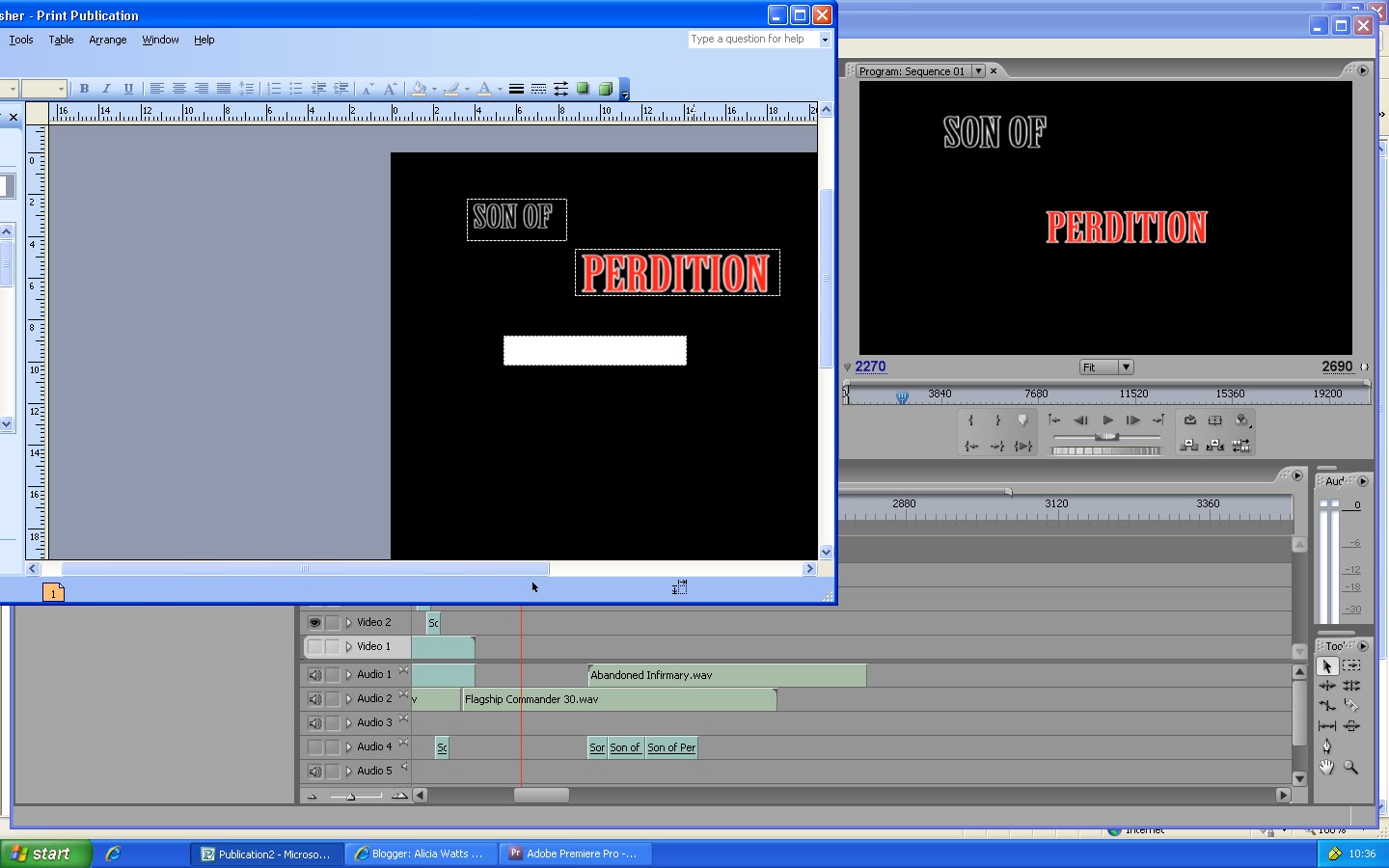

This will be the layout for my poster. As you can see, I have inserted the title at the top, 'Perdition' being separate to 'Son of' because it is more dramatic. It is in capitals so it stands out and one can recognise this as the title of the film being presented. At the bottom, the tagline is in red to relate to the word 'Perdition' also representing blood and danger. Then, it says 'coming soon' and in smaller font is the website and production company.


This poster represents my final ideas.

Note; I have added in a restriction image at the left bottom corner so it representes the type of film it is. Conventionally, teaser posters do not have the certification on the poster. For example;


