Thursday 13 October 2011

Furthur analysis; Hot Fuzz

http://www.workingtitlefilms.com/features/video/id/161/teaser-trailer-2
The trailer sets the police scene immediately. The intro contains a guy pretty obviously shop lifting. The policeman comes and there is a close up of both characters eyes, as they know what's going to happen. The next clip shows the comical aspect of the film, and here the audience can positively define the genre; Action/Comedy. Once this is established, the universal logo comes up, then a clip, then another editing slide saying 'from the team that brought you Shaun of the Dead'. Shaun of the dead is in bold so the audience suddenly recognises it, and it is also the same colour and logo of the film. I have noticed that most trailers present the name of the film and then a short clip until it finishes. The scene is light, showing the light-hearted comedy the film contains.
I doubt the film gets much criticism, but it does however use stereotypical teenagers, such as the one in the trailer. Also, The Daily Mirror only gave Hot Fuzz 2/5, stating that "many of the jokes miss their target" as the film becomes more action-based. Daily Mail also shared The Mirror's view, saying that "It's the lack of any serious intent that means too much of it is desperately unamusing, and unamusingly desperate".
At the beginning of the trailer there is synchronous sound of an over-voice in a supermarket to set the scene. The trailer then gets exciting when Simon Pegg says "excuse me" and the light, non-diegetic music is played. This sound represents light-hearted comedy and tension. There is also synchronous sound of their clothes rustling as they run away, to give the impression that they are running fast in determination. When the policemen get to the gardens, there is a change in music. This non-diegetic music makes the first policeman seem cool, edgy and rebellious. The music then gets louder, as editing is inserted including the title and the voice-over. There is also a metal sound when the title is underlined, and I think this is very masculine because it adds to the bold title and the manly voice. A key point is when the other policeman copies him and crashes into the fence- the music immediately stops when this happens indicating dumbness. Diegetic sounds of him struggling and out of breathe also shows that he is not used to this, and perhaps not fit enough to be a policeman which is very comical.


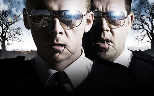
Lighting is used in the picture to attract certain details, such as the image reflecting from their sunglasses. In this case, the dark shadows isn't used to emphasis the villain, it is perhaps used to show that the characters are 'cool' and to represent the minor dark element to the film. Like my poster, I will also use a close-up of my main character. The colours used are black, white and a hint of blue (like police uniforms). The black and the white colours are juxtaposed to the blue. Black is associated with mysteriousness and darkness, where as, the white's connotation is purity and innocence. Both blue and white represent a calm and earthy feel. Both characters look serious, perhaps hiding the comical side. However, I think they look a bit too serious! The fact that they are both doing exactly the same thing, with cocktail sticks in their mouth is quite humorous.

How much do audiences remember of adverts?

How much do audiences remember if adverts?

Chigra1
This is a study taken out in 1989, to see how students study and use examples in learning to solve problems. As you can see, more students take in more information when doing, collaborating and seeing&hearing than just reading, seeing or hearing. I have taken this into account because 'students' are in my target audience age range (teenagers). Therefore, I will not be putting much texts in my trailer so the audience don't have to read a lot, and I will obviously combine visual images with audio.

Comparingly, Dale's Cone of experience doesn't use quantitive data. Somewhere along the way, someone unnaturally fused Dale's Cone and Treichler's dubious percentages.
Chigra2

Attitudes towards violence on TV
On British television, an estimated average of one violent scene occurs every 16 minutes. At schools, many educators have reported a marked increase in children's aggression both on the playground and in the classroom during the past decade (Barlow & Hill, 1985). This is why my target audience begins at age 15. Many critics believe violence on television can influence teenage behaviour.


  • Is emotional violence just as bad as physical violence?

  • Anyone can be hurt both physically and mentally. Yelling, name-calling and threats are what kids are most likely to experience in the school. Emotionally, violent acts can begin a cycle that leads to physical violence. For example, pushing or shoving, hitting or punching.


  • How do you think TV violence affects children?


  • In some cases, violence presented to children on television may cause children to see the world as a scary and dangerous place; that violence is a normal part of life; that violence is a good solution to many kinds of problems; makes kids less sympathetic to victims of violence; makes kids more interested in violence, both as a form of entertainment and in their real lives; and encourages them to copy the acts that they see on TV. Another area of concern is the addiction factor - the more violent action kids consume, the more they need that level of action and excitement in their entertainment.

    How important are film posters in determining what people go to see?
    An example of how different types of film (e.g. horror) poster use these forms and conventions to attract a certain type of person (e.g. teenagers, horror fans) would be a really scary horror film, which will use eerie images in order to appeal to horror fans. A successful film poster will accomplish attracting the target audience and persuade them to come and watch the film. What attracts audiences- the language used, denotations and connotations, colours/semiotics that stand out and institutions and creators.

    What do audiences do while adverts are on TV?
    In my opinion, if you are watching a film or television programme, people either don't take notice or they flick over or leave the room. There are differences between the typical home environment and cinema. Homes are places full of distractions, and in a cinema you are less likely to leave when the adverts are on. Cinemas also have large film screens which are more dominant than a TV at home. Much research has suggested that while the television is on for large amounts of time in the average household, attention is very rarely truly focused on it. Some people see adverts as 'wallpaper TV'.

    Monday 10 October 2011

    Comparative research: Shrooms

    'Shrooms' is a 2007 horror film rated 18, directed by Paddy Breathnach.
    Shrooms Poster
    Three couples go to Ireland woods to collect magic mushrooms and trip out. On their way they meet some strange inhabitants of the woods and it doesn't take long until a creepy story is being told at the campfire which might be more than just a story. So strange things happen, people start disappearing, silhouettes move through the woods and the creepy story starts to melt into reality. The horror kicks in along with the effect of the mushrooms.
    Opening Weekend: £313,758 (UK) (25 November 2007) (199 Screens).


    http://www.rottentomatoes.com/m/shrooms/ This website gives an insight on how the film was reviewed. Unfortunately, the percentages for audience rating is quite low. On average, out of 15,653 people, Shrooms got a rating of 2.6 out of 5.


    On IMDB, 6,677 IMDb users have given a weighted average vote of 4.7 / 10. Here, I can also work out their target audience as it shows what gender and ages are more likely to watch the film and if they liked it or not. Although females have rated the film higher than males by 0.3, there were only 909 who have voted. Whereas 5,048 males have voted. So this information may be flawed and does not contain accurate data. However, we can analyse that more males have perhaps watched the film, and have visited the website and offered to vote.


    Trailer:

    Sunday 9 October 2011

    Poster and webpage design

    Looking at many horror posters, I found that the title of the film was below the main picture, as seen here (right). Like this horror poster, I will include the main character looking scared and a glimpse of the horror aspect. For example, in this poster the horror aspect is the hands grabbing her, and in mine will be a dark figure in the background. The fire clearly symbolises hell and it is at the bottom of the poster because hell is seen as underground. The mist/fog in the background is dark, mysterious and ominous (compared with the fire which is bright and dominant- where the attention of the viewer looks). There is also a suburban area in the background, showing normality and that she isn't in hell yet. The woman is pretty and blonde, representing that she is a typical damsel in distress. The unnatural hands are abnormal, and the attention isn't immediately drawn to them.
    At the bottom of the poster, there are aspects of advertising, e.g. the website. It tells us the directors, actors, producers etc.


    Here is my poster design...


    On the right is a print screen of a webpage for 'Saw'. The tabs/links are at the bottom, so the attention isn't immediately drawn to them. The attention is on the picture of the hands. This represents death and perhaps pain. The background is black which is conventional. I think it is clever that they have merged the hands into a glove, giving a sense of disturbance. I think it's good that they link the homepage to Facebook and YouTube because lots of people use these sites. However, it may take away from the mood of the website as it is meant to be scary, and then the blue colour over the Facebook sign stands out and makes the viewer back to reality.


    Here is my webpage design...


    Saturday 8 October 2011

    Website research


    As you can see, I have annotated the website for 'Shutter Island' using Paint. Please click to enlarge.
    I quite like this web-page because it offers lots of promotions for the film. When it loads up, it is animated as the loading bar moves. On the main page as seen above, there is also animation which I find very clever. The colours are quite dark giving a sense of mystery and this gives us an insight into the film genre. A common convention for a film web-page is to have the same setting and colour scheme as the poster and opening title sequence. It is also very common for the trailer to be embedded on the front page, as will I do for mine.


    It is clear that the audience for this film are teenagers; as the character's are teenagers. Stereotypical teenagers are rebellious, as we can see this here because they have been swimming with their clothes on. This might mean that they are not meant to be in the swimming pool. The slogan "Two guys. One girl. Game on." gives us an insight to the synopsis. This is also a typical teenage film storyline; where two boys fight over a girl. Unlike 'Shutter Island', the picture takes up the whole page as a background, which draws attention to the characters and their surroundings. The use of blue represents the boys, and the red may represent love. Or maybe even blood as things get dangerous towards the end. A cherry bomb is a dangerous firework which also represents the storyline and the character's personalities, as they are very outgoing and rebellious which links to an explosion of a firework.


    Corpse Bride is a stop-motion-animated fantasy musical film, and we can see this animated fantasy portrayed through the website. The main purpose of this website is to promote the film on DVD so viewers go out and buy it, although, the site implies they don't even need to move from their chair as you can order the DVD through the website through the links "About the DVD", "Own it on DVD today" and "Own it on DVD". This constant repetition is drilled into the viewer's head so that they are reminded of it where ever they look. The still-motion picture of the animation makes a good background because it shows the two main characters in the foreground and other less-important characters are seen in the background, such as the skeleton dog. It is clear that the genre is a fantasy because of the swirly writing, moonlight and plants that are also curly relating to the scene and writing. The moon behind the characters is centred and bright in contrast to the dark blue atmosphere; this also gives a romantic feel to the characters because they are holding hands and dressed smartly, showing that they have just got married or are getting married. Although we can not see the tagline like other film sites present, it is shown on their poster which is more critical to this film.

    Friday 7 October 2011

    Poster Research

    Screenshot

    This poster is very effective, mostly due to the dark lighting added in the editing process. The darkness contrasts with the main characters pale skin. This gives the impression that he is motionless and dead (in terms of his personality). This may clearly present that he is the villain because he has no emotion and is hiding away in a dark, old room. The colour red that is used means that danger, death and blood are near. The red that is used over the title is extremely important because it shows the smear of blood. I like this poster but I think it is too organised. The character is facing and looking directly at the camera, showing he is aware of the audience. This could be creepy because it is like he is watching you.


    Screenshot

    This poster is very different from Sweeney Todd, the poster here seems like it is more innocent. The colours are very light and neutral, contrasting with the redness of the rose. The red here doesn't connotate blood; it is represented as love and passion. Like the previous poster, it is based on one colour. However this poster dominates with the skin of a woman (supposedly). You can tell it is a woman because of the soft skin, delicate hands and rose. The peachy colour to the skin represents warmth. "Beauty" is in bold to stand out as one of the most important words in the title. The picture of the stomach, hand and rose is obviously related to beauty. It may also be sexualised as it looks like it is implying that the person is naked.


    This poster is very busy and colourful to stand out from other posters. It makes it clear what genre it is (comedy) by the use of bright colours, teenage characters, font, the character's style and their facial expression. It also says it is a comedy in the quote on the top right-hand corner. I think the producers have placed it here because when people look at a poster, after they see the picture, they begin reading from the top. The font of 'Juno' is bubbly and almost like someone has drawn/shaded it in. This is a very good comic type effect. The characters we see are of course the main characters. The boy is tall, average looking, and wearing what seems as silly sport wear. By this we can see that he is the most comical character, where as the also average-looking girl has a "I'm not impressed" type facial expression. The way she is standing emphasises her pregnancy, she is facing the side so that we can see her big stomach, we can also recognise her pregnancy because she has her hands on her back to stabilise her. Her top is orange and white stripes to match the background of the poster. She is a typical teenager in terms of her attitude which is also presented through her clothing; a leather jacket, skirt, ripped jeans and trainers. Some people believe that teenagers don't care about anything, and this shows through her type of clothes and the fact she doesn't look bothered that she's pregnant at such a young age. Shown through my points, the target audience are, without a doubt, teenagers.

    Thursday 6 October 2011

    Comparative research and textual analysis: Insidious

    Insidious is a 2011 American independent supernatural horror film written by Leigh Whannell and directed by James Wan. The storyline: A family looks to prevent evil spirits from trapping their comatose child in a realm called The Furthur. At the end of the film, the evil spirits eventually make it into the real world and to cause pain to others. Like my media product, their is an evil spirit lurking after victims in our world.

    Here is the trailer for Insidious:


    This film, in my opinion, has great cinematography. Even from the opening credits, the makers create an intense, haunting tension by editing the lighting to make it darker and more creepy, and zooming in slowly makes the audience anxious. It does not rely on blood and gore to scare the audience. The tension is much deeper, and heavily relies on sound. It uses quiet, sneaky sounds to bring you in, and makes you jump when non-diegetic loud music is played, and this is when you know something will happen. It intensifies every situation and is what separates its self from other realistic horror movies like Paranormal Activity.

    The mise-en-scene is typical for a horror film. The regular family live in a nice middle-class house in a quiet neighbourhood. The hospital equipment in the boy's room gives the feeling of something dangerous and unstable. It also may indicate pain and death. Beds usually symbolise resting and comfort but it is uncomfortable knowing that a possessed boy is always in this bed.

    There is an eye-line medium close-up of the father which is a very powerful shot as it shows the his distressed facial expression. This is quite unconventional because men are usually seen as strong.

    There is a montage of shots when the child is in hospital. It begins with a close up of the distressed couple and then changes to an over-the-shoulder long shot of the child in the hospital bed. A hospital has connotations of death, pain and illness so seeing the couples gaze at their injured child can actually cause other people to emphasise with them as a parental instinct. There is an eye-line pan when the mother is investigating the rooms as she senses a presence, the camera angle is from her perspective and the pan represents her head movement as she gazes at one room and then to another. This creates suspense as the audience can only see what the character is seeing so it puts you in her perspective that creates a creepy tension.


    There are many fast cuts (editing) later on in the trailer for suspense. There is a quick close-up of a demon which makes the audience jump, especially because the red of the demon's face stands out. It leaves the viewer with a mental image of the demon actually looks like and this can vary on each viewers perception which then influences social interaction.

    In terms of 'Maslows Hierarchy of Needs', this film trailer includes few of the key themes promoted by the theory. The theme of safety isn't offered, but slightly juxtaposed, it may be taken away by the intelligent storyline of which provokes the emotion of fear and adrenaline with the twisted plot. The theme of affiliation is offered as the viewer feels like they aren't the only individual that is feeling this emotion, its reassuring to know that everyone is witnessing the same thing. Lastly the sense of esteem, this may just be from the feeling of knowing "its just a film" and that you can return to safety and reality after.

    The words "Insidious is" cross fades and changes place for example, "Insidious is...Is Insidious". This is a powerful technique as not only is the film title ambiguous they have adapted the definition of Insidious to link to the definition of the film. Insidious means something that proceeds in a gradual, subtle way, causing harmful affects.


    The website http://www.rottentomatoes.com/m/insidious/ says that Insidious got an average audience rating of 3.5 out of 5. A critic from the Daily Telegraph said "Plays out in such a high, trilling key of baroque anxiety it's both jumpy and ludicrous."


    On http://www.imdb.com/title/tt1591095/ratings, 38,729 IMDb users have given a weighted average vote of 6.8 / 10. This shows that a lot of people have seen the film, which means it probably has a good trailer. This film has attracted more males than females. We can see this because 30,288 males have voted, and given an average of 6.8. 6,936 females have voted and given an average of 6.9. Stereotypically, Women get more scared than men, and this contributes and backs-up these statements. In the age categories, the ages that have voted the most are between 18 and 29 (even though it is rated a 15).

    Tuesday 4 October 2011

    Interviews

    As well as a questionnaire, I have interviewed some of the public that fit in to my audience age range. I asked them several questions, such as: 1. What would you expect in a horror trailer?  2. Do you enjoy horror films or do you prefer a different genre?  3. What's the scariest film you've seen?  I have taken their answers into consideration, and I have now looked at what films they have mentioned, and taken into account the conventions of a horror trailer. 
    Below is a sample of the feedback.


    Monday 3 October 2011