Friday, 6 April 2012
Thursday, 23 February 2012
Effects of audience feedback; the changes

I was told the contact form didn't fit in with the theme - so I have altered the style and colours to fit in with my black and red colour scheme. Thank you audience feedback!
I was also told that if I uploaded my trailer onto vimeo first, instead of uploading straight from premiere pro to my blog, the quality would be better, and accessibility would improve.

I have changed 'local, spooky woods' to 'forbidden forest' in the text. This is because I think that 'forbidden forest' has a better effect - like an alliteration. I thought 'local, spooky woods' seemed a bit childish, comical and too simple, so to target my target audience I changed this, also because I added a similar effect to the added rhetorical question 'With the help of an old, creepy medium, will his life ever be the same?' This is to make the viewer think more, and eager to answer the questions be watching the trailer and film.
Also due to audience feedback, I have added the tagline 'Dream of Death' in a secretive place. Found it yet? Well, it is at the bottom right-hand of the screen, and is lit up by the red glow effect when it goes by. I think this was an extremely good idea because it is something for the audience to engage with and spot. It is also symbolic of my film - hidden meanings and mysterious cases. The glow effect is slow enough for the viewer to read the slogan, but fast enough to make the viewer look again.
At the bottom of the page, you can see that I have added an audio transition. I previously wanted the music from my trailer to play, but due to technical difficulties, I was unable to. To get passed this downfall, I inserted audio music from what Wix had offered. 'Atmosphere', it seemed to me, was the best short-clip of music they had to fit in with my genre of film.

This shows that I have inserted a slide of pictures instead of the viewer clicking on a link. My target audience thought it was too much trouble, didn't fit in with the theme and wanted it just to be pictures that I have taken. So here we are! The whole reason I didn't do this in the first place was because it kept coming up with 'error' but because of my terrific technology skills I have altered this. The skin is 'black tape' which roughly borders the pictures, giving a great horror-theme effect. I also added the subtle mirror effect, like I have done to the contact page, to relate to the mirror scene in my trailer. The pictures I have inserted on this page are behind the scenes; location and characters. The two actor pictures you see here are unseen pictures that are not included in the trailer. The second B&W image is me, the director as I also play the spirit, in 'A Woman in Black' style. This is so the viewer can really recognise how influential horror films can be.
In a peer review discussion group, I was told "It would be professional and sensible if you were to put the age certification logo on your site, and perhaps even short reviews from newspapers so that your audience can see the quality of your storyline and persuades viewers to watch more".

Therefore, these are my changes. I decided to put a star rating on (3 star to make it realistic) AND a quote from a newspaper. I'm not sure if I'm allowed to do this, since it is not legit, but I have seen other media products do this. I will find out next lesson.
View the changes on my website here:
Sunday, 19 February 2012
Feedback survey results

What needs improving? As you can see, 75% of candidates this the webpage needs improving, 25% think the poster, meaning 0% think the trailer. This indicates what needs to be my priority for improving; which is the webpage. I will look at the answers for 'Suggest improvements' and make the improvements.

These are the main comments that came up. Therefore, I will change: (webpage) colour scheme and style of the contact page, improve the blurb, add the slogan, add music.

Responds for 'Would you be interested in watching the full film?'. None of the candidates said 'No', which is positive. 25% said other, but this is only to make sure their suggestions were put into account. Which, of course, they will, therefore the majority said they would!

Sunday, 12 February 2012
The Three Act Structure
Syd Field, author of Screenplay and The Screen Writer's Workbook, has outlined a paradigm that most screenplays follow. A paradigm is a conceptual scheme. This paradigm is the structure that holds screenplays together. According to Field, screenplays follow a three-act structure, meaning the standard screenplay can be divided into three parts: Setup, Confrontation, and Resolution.
Act I comprises the first quarter of the screenplay. (For a two hour movie, Act I would last approximately 30 minutes.) As mine is a trailer, this is the first 30 seconds.
Act II comprises the next two quarters of the film. (For a two hour movie, Act II would last approximately 60 minutes.) Meaning my trailer it will be between the one minute mark.
Act III comprises the final quarter of the film. (For a two hour movie, Act III would be the final 30 minutes.) The final 30 seconds in relation to my trailer.
The Three-act Paradigm:
Friday, 10 February 2012
Thursday, 9 February 2012
Editing Process
The programme I have used for editing is called Adobe Premiere Pro CS3. This is the programme we need to edit on in school. If I had a larger budget, I would be able to buy more advanced and higher quality software.

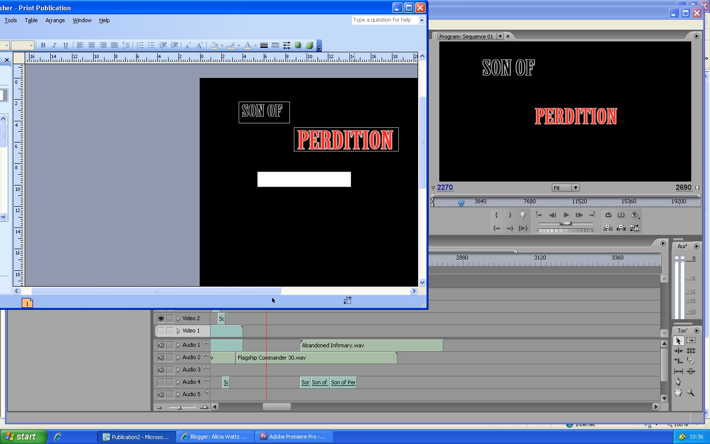
I had captured the film from the video camera and I've imported it into the programme. The first thing I need to do is use the Razor Tool for cutting parts of clips that I don't need or that need shortening. This is a print screen of this process.

I need to produce a film production company logo for it to show at the beginning of the trailer, as it is a necessity. I have inserted a new title and chose from the templates, a medical one.

I then changed the rectangular background into 'arc' so that it would be more advanced and interesting. I also added the effect 'mosaic out' which is shown above.

I went on http://www.freesound.org/ to look for some sound effects to fit in with 'mosaic out' and I came up with the idea that this effect is like glass shattering, so I found a sound effect of this (similar to what Foley Artists do) because it sounded realistic. It would have been better if there was a shattering effect included in Premiere Pro but unfortunately I will have to settle for this.

I filmed some paintings/pictures included in a book I found at home. I did this because they are quite creepy images, so this would fit in with my genre. Other films that use this technique is 'Twilight', when Bella looks up on the internet about vampires and relates it to Edward. I have used the old fashioned technique to this and have used a book. This causes a mysterious sense as the viewer wants to know what ideas the images in the book are trying to give off.


This is a title in the editing process. I have put the two phrases separately for a refracted effect. They are also of different fonts to show that 'Inevitable' is a film. I have also used blur in and out so it is not part of the actual film.


This is an example of when I alter how loud the sound is. In this clip, there is dialogue and music so I've got to make sure that there is a right balance between the two sounds, so you can hear both. Here, I increased the sound of the dialogue from 0.0 to 5.0dB. You can also see in this screenshot, that I have added many 'dip to black' effects during blackouts; this is so the clips flow together, but only some of them because I want certain clips to be detached and jumpy.
Monday, 30 January 2012
Wednesday, 25 January 2012
Monday, 23 January 2012
Friday, 20 January 2012

Thursday, 19 January 2012
Animatic Storyboard
I have produced a photomatic instead of drawing the storyboard. This is a series of still photographs presented in a sequence. I took pictures for the frames with an iphone4 to enable a clearer visual. I then recorded the sequence of photos and added a voice-over to explain what is included in that shot (e.g. dialogue and staging).
Wednesday, 18 January 2012
Script and shooting sequence
SCRIPT
Mother: Don't go in those woods, Matt
Matthew: I won't
Voiceover: From the makers of Inevitable
Car drives
Voiceover: A thrilling tale
Matthew: Honey! (keeps calling the dog)
Noise of spirit
Faster bmp of music- screen goes black, cutting to a range of scenes
Matthew: (voiceover) I laid low when I could've stood hight, I tried to ignore it but I don't know why. It always finds me.
struggling in his sleep, complaining to his girlfriend, isolated from family, creepy pictures overlapping and merging, switches to an isolated house and grandfather clock
Old woman: The spirit is trying to posses you
'Son Of Perdition'
Slows down at mirror scene- washes his face, figure in background
glipse of spirit, and blood
'Coming Soon'
SHOOTING SEQUENCE
http://www.bbc.co.uk/journalism/skills/production/shooting-sequences/shooting-video-tips.shtml
This website has enabled me to use a variety of shots and resources used in my trailer.


Tuesday, 17 January 2012
Foleying
Foley is a term that describes the process of live recording of sound effects that are created by a Foley artist, which are added in post production to enhance the quality of audio for films/video. Using my phone, I recorded the sound of slamming on a piano, wind chimes and a screech. However, due to an error I couldn't upload these into Premiere Pro. To overcome this, I just had to make sure that the sound I wanted was included when filming the footage.
 For example, I set the grandfather clock to a few seconds before a whole number (such as 6 o'clock) and then filmed, waiting for it to chime. The only weakness was that the chime didn't sound as low/deep as I would've hoped, nevertheless, I stuck with the plan. I filmed the clock while it was chiming instead of recording audio of the chime itself. I don't think this hindered the film in anyway, it just gives a clearer visual of the audio transitions and makes the trailer more intense.
A film that uses a grandfather clock similar to my genre is Donnie Darko. It features at 00:59 and 1:50. Like my film, they did not use a foley artist for the grandfather clock.

SoundWorks Collection: Gary Hecker - Veteran Foley Artist from Michael Coleman on Vimeo.

A film that uses a grandfather clock similar to my genre is Donnie Darko. It features at 00:59 and 1:50. Like my film, they did not use a foley artist for the grandfather clock.
A good example of Foleying is this:

"This was for "Vroege Vogels" (air date September 22, 2009), where Menno was supposedly peeing in a jar. I created a similar sound with water and two glasses. The microphone is a Neumann TLM 170R" - http://nn.wikipedia.org/wiki/Fil:Foleying_the_water_sound.jpg
Of course, this shows that when you can't obtain the sound you want, you need to use a similar sound. As for mine, there are no 'rude' type aspects for sound like this, so I can just use the actual sound for something I want, not a different chime to the clock. Perhaps because a viewer may have a similar clock, and notice that the sound if different.
SoundWorks Collection: Gary Hecker - Veteran Foley Artist from Michael Coleman on Vimeo.
Monday, 16 January 2012
Blackouts in trailers
I have noticed that all teaser trailers use some sort of black screen during clips. I googled this and ironically, it came up with the film 'Blackout'. But this trailer also includes the blackouts I'm looking for! For example, there's one at 00:09 and there is a non-diegetic sound that comes with it. This technique is heavily used in my trailer to portray a sense of anxiety.
http://www.traileraddict.com/trailer/the-blackout/trailer
http://www.traileraddict.com/trailer/the-blackout/trailer
Sunday, 15 January 2012
The making of the poster
http://justcreativedesign.com/2008/05/13/how-to-design-a-movie-poster-with-an-example/
You can get different types of poster such as, the main theatrical;

or character poster;

I am creating a teaser poster, which means it will include basic information which will not indicate much about the plot, will contain an image of main character(s) and the name of the film, similar to a main theatrical poster.
Images: Son Of Perdition will be made up of black and red colours and a unique, creepy font. This is to show that it is a horror genre. I was contemplating whether to put the actor's names on the film poster as they will not be recognisable as they are not famous. Although they are an important content, films with low budgets will find actors such as Thomas Turgoose who will be more popular. The main image on the poster will be the main actor in the foreground looking scared and on the right in the background will be a black figure. This setting will be in the woods, because it is the most dominant part of the film and the main stereotypical atmosphere where everything changes. All in all, the main colours will be dark and mysterious as the content and figure is mysterious, which makes it intriguing. When seeing the poster, the viewer will automatically know it is a horror because of the scared expression on the boy's face. When they see the figure in the background they will think that the boy is being chased. By using this 18-year-old boy, it will determine my target audience of 15-30 year-olds as the stretch target. The target audience will probably like this if they are into psychological thrillers as well.
Narrative: It is clear to identify the genre of the film and the types of characters from their facial expression, body language, stance, appearance and position on the poster. The impression you get of the character/personalities is that the boy is average (clothing) and scared (expression). An enigma is being presented through the mysterious figure. The key image will not be a still from the film, but it will be similar to it (for example, they do this for most film posters such as 'Jennifer's Body' and 'Prom Night').

I have thought about the layout of my poster and have researched others to get ideas. I will concentrate on completing the poster once the main task (teaser trailer) is complete.
Layout: The poster will not be a montage of images merged together unless the camera shot does not work when I try to take the picture as there may be trouble with lighting. Such problems can arise because of the sun going down quickly; therefore I would need to shoot it on several nights at the same time. If it is difficult getting both actor's in the same shot I will take it separately and merge them next to each other. Improvements in technology have changed production values- so I will be able to produce and print it using DTP. I will also be using a tag-line- see one my previous posts to view sketched layout 'poster design'. It will include credits information in small print at the bottom like all film posters, including cast, director, distribution and promotion companies. The certificate will be at the bottom to the left. The poster will list the website to promote it further.
Above, you can see a print-screen of fonts. I found these on http://www.urbanfonts.com/, in the category called 'scary'. This is so it will meet my chilling theme. I don't want a font that is too over the top because it will seem comical. I need a font that fits in with my horror genre and a sense of mystery.
Unique Selling Point: The Unique Selling Point is a marketing perception that was first proposed as a theory to explain a pattern among successful advertising campaigns. It shows that campaigns made unique propositions to the customer and that this convinced them to switch brands and use them or in my case to come and watch my film over another film that is out at the same time. For example- M&M's: "Melts in your mouth, not in your hand".
The most challenging content is of course the male being the victim. This is different to some horrors and challenges stereotypes. The stars are also unconventional as they're not famous. Content which is conventional are the woods. I believe these combinations of conventional and unconventional themes will attract my target audience- they can relate to my main character and be placed in their shoes. I will make the trailer intriguing by not giving too much away so the audience is left wanting more.
You can get different types of poster such as, the main theatrical;

or character poster;
I am creating a teaser poster, which means it will include basic information which will not indicate much about the plot, will contain an image of main character(s) and the name of the film, similar to a main theatrical poster.
Images: Son Of Perdition will be made up of black and red colours and a unique, creepy font. This is to show that it is a horror genre. I was contemplating whether to put the actor's names on the film poster as they will not be recognisable as they are not famous. Although they are an important content, films with low budgets will find actors such as Thomas Turgoose who will be more popular. The main image on the poster will be the main actor in the foreground looking scared and on the right in the background will be a black figure. This setting will be in the woods, because it is the most dominant part of the film and the main stereotypical atmosphere where everything changes. All in all, the main colours will be dark and mysterious as the content and figure is mysterious, which makes it intriguing. When seeing the poster, the viewer will automatically know it is a horror because of the scared expression on the boy's face. When they see the figure in the background they will think that the boy is being chased. By using this 18-year-old boy, it will determine my target audience of 15-30 year-olds as the stretch target. The target audience will probably like this if they are into psychological thrillers as well.
Narrative: It is clear to identify the genre of the film and the types of characters from their facial expression, body language, stance, appearance and position on the poster. The impression you get of the character/personalities is that the boy is average (clothing) and scared (expression). An enigma is being presented through the mysterious figure. The key image will not be a still from the film, but it will be similar to it (for example, they do this for most film posters such as 'Jennifer's Body' and 'Prom Night').
I have thought about the layout of my poster and have researched others to get ideas. I will concentrate on completing the poster once the main task (teaser trailer) is complete.
Layout: The poster will not be a montage of images merged together unless the camera shot does not work when I try to take the picture as there may be trouble with lighting. Such problems can arise because of the sun going down quickly; therefore I would need to shoot it on several nights at the same time. If it is difficult getting both actor's in the same shot I will take it separately and merge them next to each other. Improvements in technology have changed production values- so I will be able to produce and print it using DTP. I will also be using a tag-line- see one my previous posts to view sketched layout 'poster design'. It will include credits information in small print at the bottom like all film posters, including cast, director, distribution and promotion companies. The certificate will be at the bottom to the left. The poster will list the website to promote it further.
Above, you can see a print-screen of fonts. I found these on http://www.urbanfonts.com/, in the category called 'scary'. This is so it will meet my chilling theme. I don't want a font that is too over the top because it will seem comical. I need a font that fits in with my horror genre and a sense of mystery.
Unique Selling Point: The Unique Selling Point is a marketing perception that was first proposed as a theory to explain a pattern among successful advertising campaigns. It shows that campaigns made unique propositions to the customer and that this convinced them to switch brands and use them or in my case to come and watch my film over another film that is out at the same time. For example- M&M's: "Melts in your mouth, not in your hand".
The most challenging content is of course the male being the victim. This is different to some horrors and challenges stereotypes. The stars are also unconventional as they're not famous. Content which is conventional are the woods. I believe these combinations of conventional and unconventional themes will attract my target audience- they can relate to my main character and be placed in their shoes. I will make the trailer intriguing by not giving too much away so the audience is left wanting more.


This is my final design for my poster. You can see my original and first draft design of the poster on a previous post here: http://aliciawattsa2mediastudies.blogspot.com/2011/10/poster-and-webpage-design.html This shows improvements and finalised ideas I have made.
Below you can see print screens of the process, from paper to technology.


This will be the layout for my poster. As you can see, I have inserted the title at the top, 'Perdition' being separate to 'Son of' because it is more dramatic. It is in capitals so it stands out and one can recognise this as the title of the film being presented. At the bottom, the tagline is in red to relate to the word 'Perdition' also representing blood and danger. Then, it says 'coming soon' and in smaller font is the website and production company.


This poster represents my final ideas.

Note; I have added in a restriction image at the left bottom corner so it representes the type of film it is. Conventionally, teaser posters do not have the certification on the poster. For example;

The making of the webpage
I have researched which website I will use to create my website.

I have visited http://www.webeden.co.uk/. In my opinion, looks more like a website you would use to create your own business site.

Piczo.com seems like a more social-networking webpage. You can tell this because of the young people in the pictures, and bright colours. It also says "your blog" so it is also more like a blog, which is used to share your thoughts.

 |
| This is an example of one of the templates wix.com has. |

Fig1. I have settled for my orginal planned layout. As you can see, the colours red and black are used frequently, representing blood, danger, darkness and mystery. The title is at the bottom, drawing the attention to the whole page. It is in a mist of black, representing the horror genre and adding to the suspensive atmosphere. 'Perdition' is slightly bigger than 'son of' because it is the most important word in the title.

Fig2. Here, I am editing the links at the top. This is the contact page - mainly for audience feedback.


Here is the new and improved contact page. As you can see, the picture is now fully noticable than fig2.

On my 'Pictures' page on the main site, I was unable to upload more than one picture due to a template error. To overcome this problem, there is a link to another webpage I have created containing all pictures. This has worked out for the best because it's much more interactive. The first four pictures are my own, from behind the scenes etc shots. The others are from Wix. I have used these pictures from Wix because they fit in with the style and genre of my film trailer and connotations are easily matched. For example, the fog and trees represent an eery atmosphere, as it was when I filmed in the woods. The fog represents mystery; because trailers include a lot of mystery.
Saturday, 14 January 2012
Taglines/slogans
A tagline is a variant of a branding slogan typically used in marketing materials and advertising. The idea behind the concept is to create a memorable phrase that will sum up the tone and premise of a brand or product (like a film), or to reinforce the audience's memory of a product. Some taglines are successful enough to warrant inclusion in popular culture.
Some examples of memorable film taglines:
"In space, no one can hear you scream." – Alien
"Just when you thought it was safe to go back in the water..." – Jaws 2
"There can be only one" – Highlander
"One ring to rule them all." – The Lord of the Rings
http://en.wikipedia.org/wiki/Tagline
Origninally, for my poster design I came up with "There's no place to hide". However, since changing my mind and adding more clips into the trailer, I believe this doesn't necessarily relate to the film as a whole. So, I want a tagline that relates to my title "Son of Perdition" and to the films plot about possession and delusional beliefs. Therefore, I have came up with "dream of death". It is short, and has the same amount of words as my title. It relates to the fact that after watching this film, you would want to dream of your own death, as the character does. It is like someone saying "You better wish you were dead" (because it is better to have an instant death than to be tortured). Conventionally, taglines give more away and are a sentence. But I have gone against this convention by having another type of "title" for the film. Usually, they act as hints for the film. Like the film 'Scream', their slogan is "Someone has taken their love of scary movies one step too far. Solving this mystery is going to be murder". In my opinion, this is too long for a slogan because I believe a poster should be more visual. You get all the writing on the back of DVD covers, on their website or in film reviews. It would be too much to read, if say, you saw it on the side of a bus that drives past.

Some examples of memorable film taglines:
http://en.wikipedia.org/wiki/Tagline
Origninally, for my poster design I came up with "There's no place to hide". However, since changing my mind and adding more clips into the trailer, I believe this doesn't necessarily relate to the film as a whole. So, I want a tagline that relates to my title "Son of Perdition" and to the films plot about possession and delusional beliefs. Therefore, I have came up with "dream of death". It is short, and has the same amount of words as my title. It relates to the fact that after watching this film, you would want to dream of your own death, as the character does. It is like someone saying "You better wish you were dead" (because it is better to have an instant death than to be tortured). Conventionally, taglines give more away and are a sentence. But I have gone against this convention by having another type of "title" for the film. Usually, they act as hints for the film. Like the film 'Scream', their slogan is "Someone has taken their love of scary movies one step too far. Solving this mystery is going to be murder". In my opinion, this is too long for a slogan because I believe a poster should be more visual. You get all the writing on the back of DVD covers, on their website or in film reviews. It would be too much to read, if say, you saw it on the side of a bus that drives past.
Tuesday, 10 January 2012
Poster experimenting and drafting
I have considered the layout of the title on the poster I will be making. In order to establish this, I have used an app on my iphone, so fonts and colours are limited.
 |
| Here I have established a typical bus stop billboard. I have decided the title will not be in the centre or dominating the whole page as this is unconventional. |
 |
| This shows the changes I will be making. The first two words are in fancy writing which contrasts with the boldness of the word 'Perdition'. I have also changed the colour of the font to see how contrasting the colour white is. I will not be using a white background if the font if white. |
 |
Here is an example of the colours presented on a billboard. 'Perdition' stands out because it is in red and is the most important word in the title. The red symbolises blood/danger and the black font is dark and mysterious. |
 |
| Here I have edited the picture of the house and made it into pop-art. I think this is a good effect. The colours red and black represent darkness, doom, danger and blood. |
 |
| I have experimented with theme, low tone and mid tone. This one perhaps shows more detail but the colours aren't as significant. |
 |
| Again, I have experimented with the colours. I was thinking about the colour green because green orbs are associated with the supernatural. |
 |
| Here I have edited the house into a mosaic style. The picture is made up of little pictures (these little pictures are ones in my photo album). I think this is very different from usual film posters. The only one I can think of that uses this effect is 'The Truman Show' - http://idratherbeworking.wordpress.com/2009/08/26/the-truman-show/. A down-side of using mosaic style is that if I write on/over it, it will not be noticed and I will need a block of a colour background like what is used in The Truman Show's poster. |
 |
| This is an extreme close-up of the main character I will be using, concentrating on the scared/shocked facial expression. This is quite an extreme and over the top expression, which is needed if I will heavily edit the picture, as it needs to stand out. Notice I have edited the colour of the picture so it's black and white but left the colour of the eye to stand out. I believe emotion is also portrayed through the eyes and this is why I have done this. The rest of him is black and white to show his motionless state. |
 |
| Here I have made the picture mosaic. I'm not sure if this works with a close-up picture because I think it looks too busy. |
 |
And here I have made the picture into pop-art. I like the colours red and black as these fit into my horror genre. I like how it has concentrated on the detail on the eye. |
Subscribe to:
Posts (Atom)