The trailer sets the police scene immediately. The intro contains a guy pretty obviously shop lifting. The policeman comes and there is a close up of both characters eyes, as they know what's going to happen. The next clip shows the comical aspect of the film, and here the audience can positively define the genre; Action/Comedy. Once this is established, the universal logo comes up, then a clip, then another editing slide saying 'from the team that brought you Shaun of the Dead'. Shaun of the dead is in bold so the audience suddenly recognises it, and it is also the same colour and logo of the film. I have noticed that most trailers present the name of the film and then a short clip until it finishes. The scene is light, showing the light-hearted comedy the film contains.
I doubt the film gets much criticism, but it does however use stereotypical teenagers, such as the one in the trailer. Also, The Daily Mirror only gave Hot Fuzz 2/5, stating that "many of the jokes miss their target" as the film becomes more action-based. Daily Mail also shared The Mirror's view, saying that "It's the lack of any serious intent that means too much of it is desperately unamusing, and unamusingly desperate".
At the beginning of the trailer there is synchronous sound of an over-voice in a supermarket to set the scene. The trailer then gets exciting when Simon Pegg says "excuse me" and the light, non-diegetic music is played. This sound represents light-hearted comedy and tension. There is also synchronous sound of their clothes rustling as they run away, to give the impression that they are running fast in determination. When the policemen get to the gardens, there is a change in music. This non-diegetic music makes the first policeman seem cool, edgy and rebellious. The music then gets louder, as editing is inserted including the title and the voice-over. There is also a metal sound when the title is underlined, and I think this is very masculine because it adds to the bold title and the manly voice. A key point is when the other policeman copies him and crashes into the fence- the music immediately stops when this happens indicating dumbness. Diegetic sounds of him struggling and out of breathe also shows that he is not used to this, and perhaps not fit enough to be a policeman which is very comical.

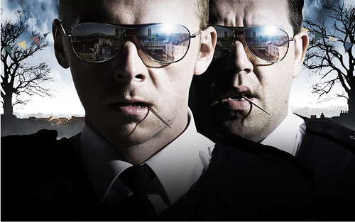
Lighting is used in the picture to attract certain details, such as the image reflecting from their sunglasses. In this case, the dark shadows isn't used to emphasis the villain, it is perhaps used to show that the characters are 'cool' and to represent the minor dark element to the film. Like my poster, I will also use a close-up of my main character. The colours used are black, white and a hint of blue (like police uniforms). The black and the white colours are juxtaposed to the blue. Black is associated with mysteriousness and darkness, where as, the white's connotation is purity and innocence. Both blue and white represent a calm and earthy feel. Both characters look serious, perhaps hiding the comical side. However, I think they look a bit too serious! The fact that they are both doing exactly the same thing, with cocktail sticks in their mouth is quite humorous.
I think I share the thoughts of the Daily Mail (unfortunately.
ReplyDeleteSo what, if anything will you take from this trailer?